What to Wear with Mixed Prints
The three rules that make print mixing read editor instead of costume — Diana Vreeland's, Iris Apfel's, and Dries Van Noten's playbook.
Three rules make print mixing read editor instead of costume — vary scale, repeat one color, anchor in a solid neutral. Diana Vreeland used them at Vogue, Iris Apfel built her style on them, and Dries Van Noten has rotated them through every collection since 1986.
- Vary the scale — pair a large print with a small print, never two prints at the same scale
- Repeat one color across both prints — the visual link the eye reads as intentional
- Anchor in a solid neutral — at least one piece in cream, white, black, or gray to ground the prints
- Stripe + plaid is the easiest entry — both are linear, color-overlapping is straightforward
- Polka dot + stripe is the second-easiest — varied geometry, single-color anchoring
- Limit to two prints maximum — three reads costume in almost every context
- Don't mix three or more prints — reads costume, not considered
- Don't wear two prints at the same scale — reads accidental, not deliberate
- Don't skip the solid grounding piece — the look reads like a clash without it
Print mixing in fashion is older than the rules that govern it, but the modern technique begins with Diana Vreeland. Her tenure at *Vogue* (1963–1971) introduced deliberate pattern-clashing into mainstream editorial — *Why Don't You*, her column at *Harper's Bazaar* before *Vogue*, was already pushing the same agenda from 1936.
Iris Apfel made print mixing the public face of New York creative dressing across her 70-year career; her 2005 Met Costume Institute retrospective, *Rara Avis*, is the public archive of her technique. The most wearable route is not maximalism first — it is one repeated color, one clear scale contrast, and one print that behaves like a neutral.
Dries Van Noten built his Antwerp Six debut (1986) on print mixing and has rotated the same approach through every collection since. The MoMu Antwerp retrospective *Dries Van Noten: Inspirations* (2014) documents the same lesson across thirty years: a print combination needs structure before it needs volume.
The technique has three rules: vary the scale of the prints, repeat at least one color across both prints, and anchor at least one piece in a solid neutral. The eye reads the color repetition as intentional, then uses the neutral piece as a resting place.
The risks are mixing three or more prints, matching the scale, or skipping the solid base. The fixes are the three rules, applied consistently. The hardest part of print mixing is restraint; the easiest is following the rules.
Diana Vreeland made deliberate pattern-clashing into mainstream editorial across her tenure at *Vogue* (1963–1971); Iris Apfel made it the public reference of New York street style for seventy years; Dries Van Noten has rotated the same technique through every runway collection since 1986.
Wear it with
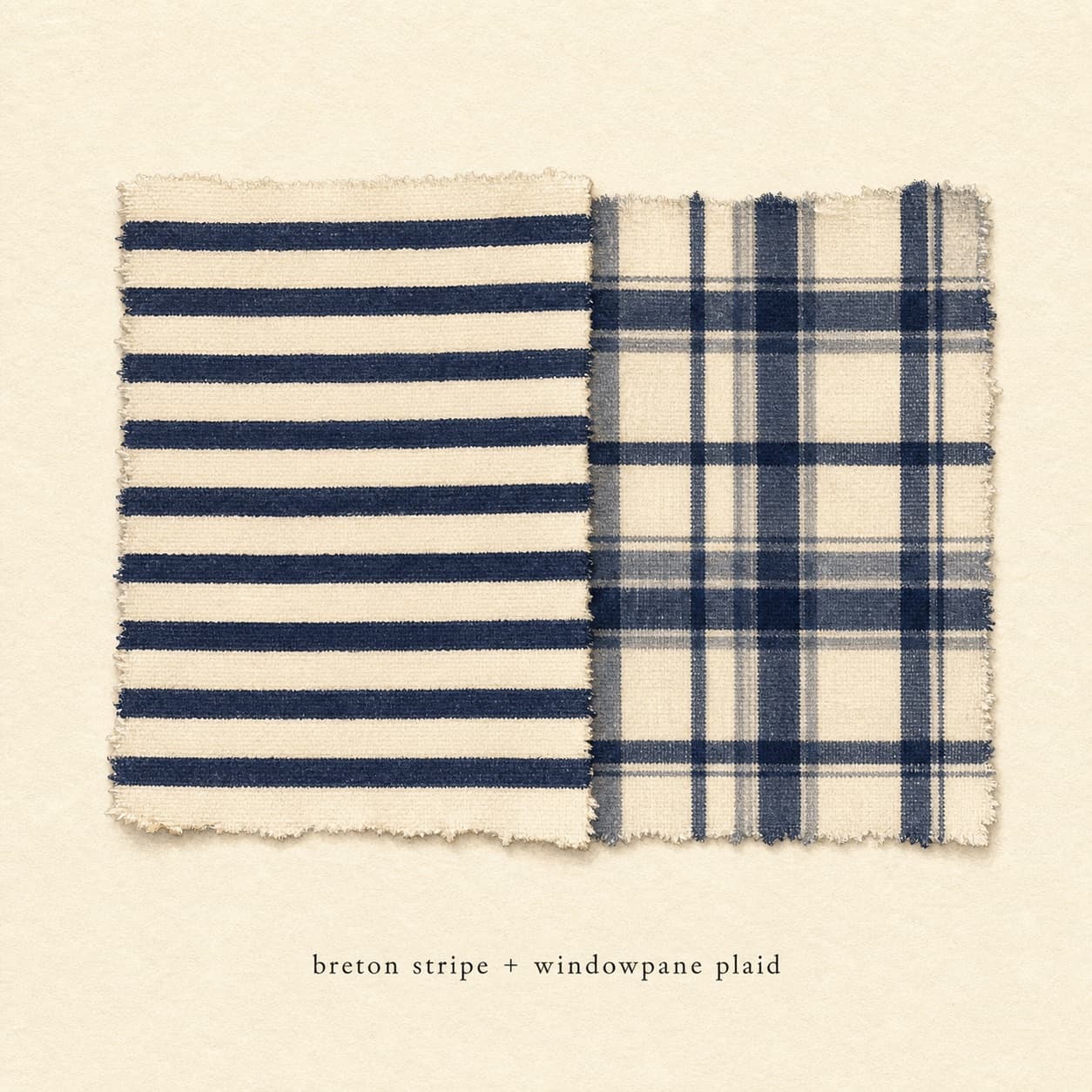
 01Stripe + plaid — the easiest entry
Both prints are linear, which means the eye reads them as related rather than competing. The classic version: a Breton stripe (cream + navy) with a navy + cream plaid trouser or skirt — color repetition makes the combination read intentional. Vary the scale (thin Breton stripe + medium plaid, or wide stripe + small windowpane plaid) to avoid same-scale flatness. Saint James (Breton specialist since 1889) and Burberry (plaid heritage since 1924) are the heritage references. Skip same-color stripes and plaids — the lack of contrast collapses the combination.
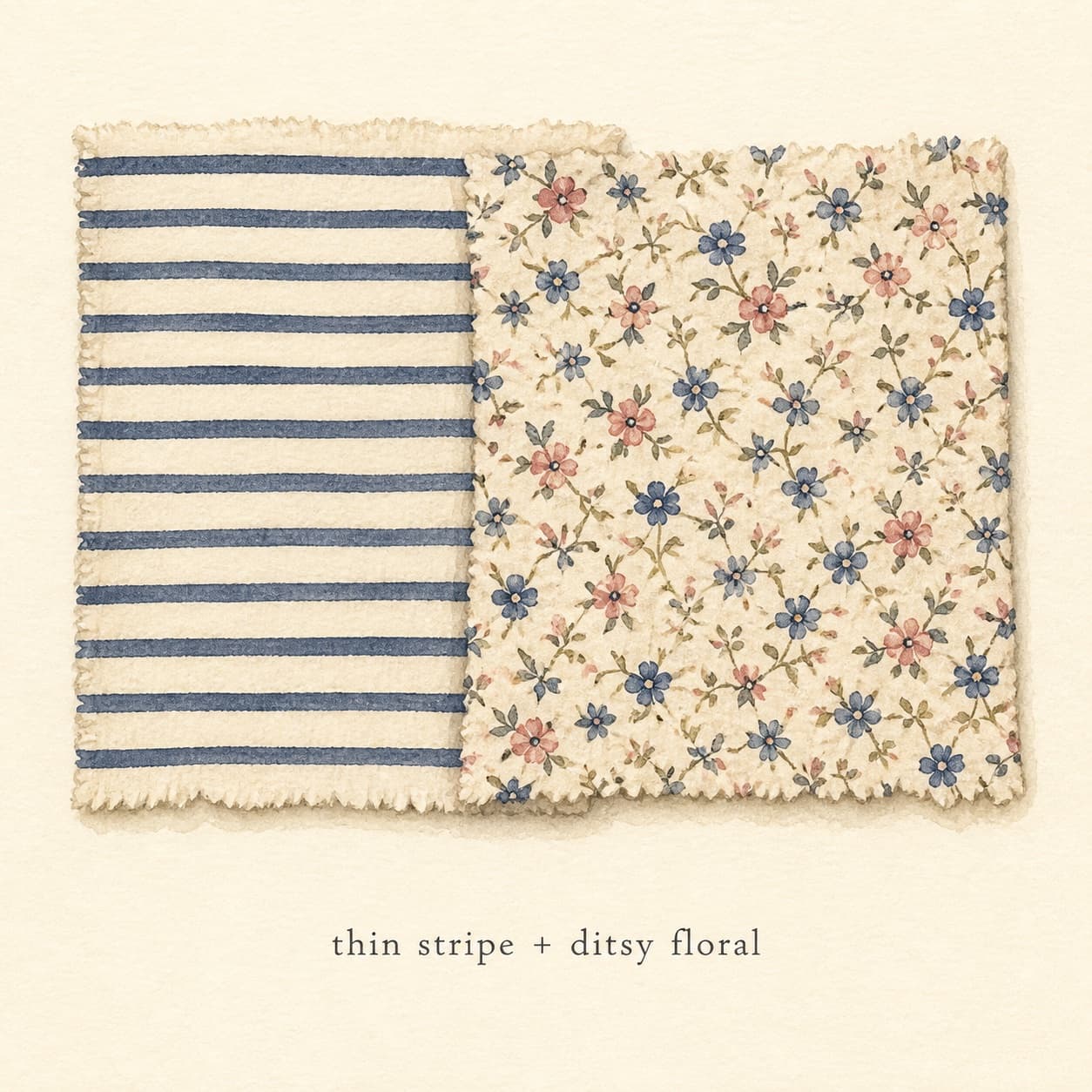
 02Stripe + floral — the warmer-weather classic
Stripe + floral is the second-most-cited print combination after stripe + plaid, photographed in J.Crew, Boden, and Anthropologie summer editorial since the early 2000s. The geometry contrast (linear vs. organic) makes the prints read distinct rather than competing. Color repetition is the rule: a navy + cream stripe with a floral print containing navy or cream as one of its tones reads layered; a stripe and floral with no shared color reads accidental. Vary the scale — a thin stripe top with a medium-floral skirt is the safest version.
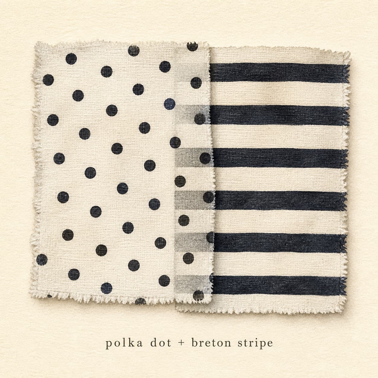
 03Polka dot + stripe — varied geometry
Polka dot + stripe is a Diana Vreeland reference and the third-most-cited combination in her *Vogue* editorials (1963–1971). The geometry contrast is high (round vs. linear) and the rule of color repetition applies — a black-and-white polka dot top with a black-and-white striped trouser reads layered, while two unrelated colorways read accidental. Vary the scale: small polka + medium stripe, or medium polka + thin stripe. Skip large-and-large; the combination overwhelms.
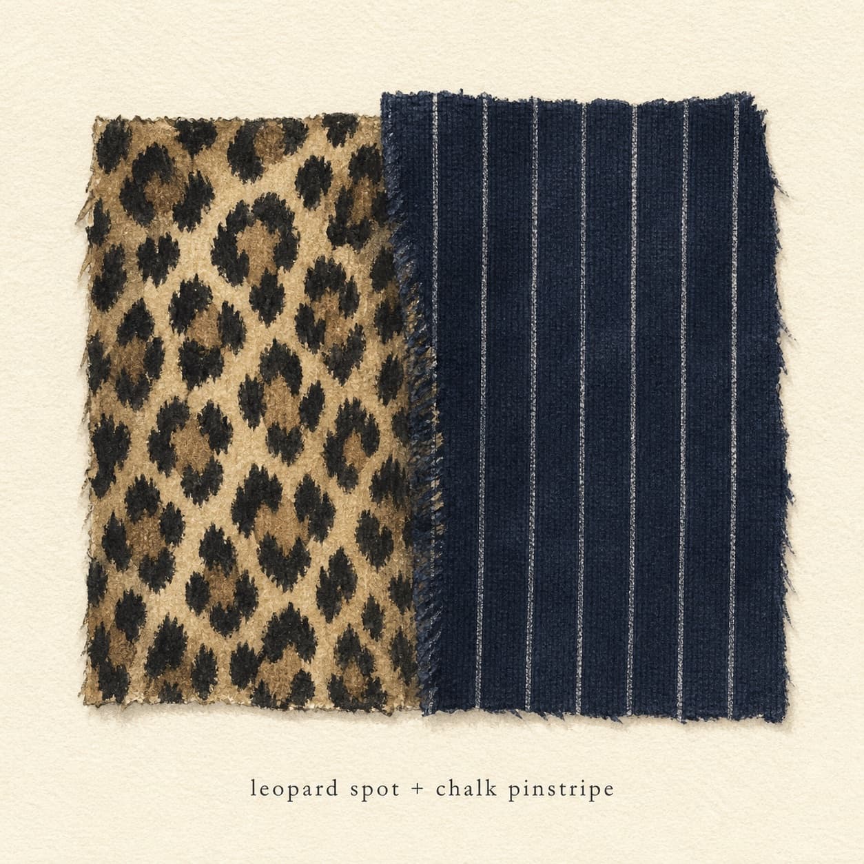
 04Animal print + pinstripe — the Carine Roitfeld combination
Carine Roitfeld at French Vogue (2001–2011) built her personal style on leopard with pinstripe — a leopard skirt or coat over a pinstripe shirt, or a leopard top with pinstripe trousers. The combination works because both prints are mid-scale and read as patterns rather than colors; the leopard's tan + black palette overlaps with the pinstripe's navy or charcoal + white. Skip pairing leopard with very saturated colors as the second print — the combination flips into costume. Anchor at the foot with a solid (black ankle boots, cream loafers) to ground the visual interest.
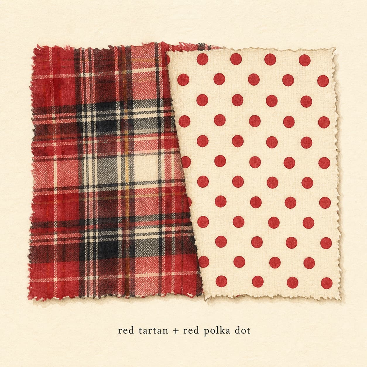
 05Plaid + polka dot — the unexpected high-execution
The most demanding combination on this list and the most rewarding when executed correctly. Plaid and polka dot have nothing in common — different geometry, often different scales, no inherent color overlap. The rule is to engineer the color repetition deliberately: a red + cream plaid with a red + cream polka dot, or a navy + cream plaid with a navy + cream polka dot. Anchor in a solid neutral piece (cream knit, black trousers) to give the eye a place to rest. The combination is a Comme des Garçons and Marc Jacobs SS2005 reference and rewards close attention to scale.
Dressing rules
Print mixing reads creative-office, gallery, and weekend; it does not read corporate-formal or classic business-casual without explicit deliberation. Two prints + one solid is the working maximum for most settings. Three prints clears the runway and a small subset of fashion-industry events but reads costume in almost every other context. For weddings: print mixing is acceptable at casual and semi-formal weddings per The Knot's wedding-guest etiquette but reads risky at cocktail and formal — the rule there is one saturated piece, not two prints. The single rule across every setting: at least one piece in the outfit must be a solid neutral. Cream, white, black, or gray as the grounding piece (knit, trousers, jacket, or shoes) tells the eye the prints are deliberate. Skipping the neutral grounding piece is the most common reason a print-mixing outfit reads accidental — the eye has no resting place and the combination collapses into clash. Iris Apfel's most-photographed outfits all include a solid black or cream piece as the visual anchor, even when the rest of the outfit is three or four patterns.
What to avoid
- Three or more prints in one outfit — almost always reads costume
- Two prints at the same scale — reads accidental, not deliberate
- No solid grounding piece — the look reads like a clash
- Two prints with no shared color — removes the visual link
- Two saturated prints together — flips into costume even with scale and color matching
Frequently asked questions
Three rules. First: vary the scale (pair a large print with a small print, never two prints at the same scale). Second: repeat at least one color across both prints (the eye reads the color repetition as intentional rather than accidental). Third: anchor at least one piece in a solid neutral (cream, white, black, or gray — the grounding piece tells the eye the prints are deliberate). Limit to two prints maximum. Three or more reads costume in almost every context. Iris Apfel's seven-decade career is the public reference for execution; her 2005 Met Costume Institute retrospective documents the technique.
The reliable list: stripe + plaid (both linear, color overlap straightforward), stripe + floral (geometry contrast, color repetition required), polka dot + stripe (varied geometry, the Diana Vreeland *Vogue* combination), animal print + pinstripe (the Carine Roitfeld combination), and plaid + polka dot (the most demanding, requires deliberate color matching). Skip pairings of two organic prints (floral + paisley) — the geometry overlap reads busy. The five combinations above cover roughly 90% of editorial print-mixing.
Yes, but the rules tighten. Two florals require: very different scales (a large floral with a tiny ditsy print, never two medium florals), the same color family or a shared dominant color (both featuring cream, both featuring blue), and at least one solid neutral grounding piece. Two same-scale florals or two florals with no shared color reads carnival. The combination is a Liberty London and Erdem reference; Cabbages & Roses (UK heritage brand) builds collections on it. For most wardrobes, swap the second floral for a stripe or polka dot — the geometry contrast is easier to execute than two organic prints.
The three-part rule — vary scale, repeat one color, anchor in solid neutral — covers most reliable print-mixing in 2026. The 60-30-10 distribution from color theory also applies to print mixing: roughly 60% of the outfit should be solid neutral (the grounding piece), 30% the larger or more dominant print, and 10% the smaller or accent print. The 60% solid base is what tells the eye the prints are deliberate. Iris Apfel's most-photographed outfits follow this distribution even when the visible interest is the print mixing.
No — print mixing has been in continuous editorial rotation since Diana Vreeland's *Vogue* tenure (1963–1971) and is currently in a creative-office and weekend register. Dries Van Noten, Marni, Erdem, and Marc Jacobs have all built recent collections on print mixing; Bode (winner of CFDA Menswear Designer of the Year 2022) is the contemporary reference. The technique cycles through fashion every decade — 1960s Vreeland, 1980s Lacroix, 2000s Marc Jacobs, 2020s Bode — but never disappears. The cycles change which prints are most-mixed, not whether print mixing is in style.